


My visual trademark: detailed scenes broken into panels
A visual trademark of mine is detailed illustrations that are broken up into smaller segments via the borders of my comics panels. Several of my readers have noted that this is a recurring motif of my work, and I was pleased that they were able to spot the pattern.
Whereas my previous blog post discussed a particular page of artwork that successfully employs this technique, today I will discuss the technique more broadly.
Let me step you through some notable examples of how I have used this technique.
Supernormal Stimuli egg-painting scene
The first time I used this technique was in Supernormal Stimuli (2011). Page 11 of the comic (below) shows my facsimile of a photo of Niko Tinbergen painting bird eggs. I composed the page so that it was three evenly-sized panels, with the image of Tinbergen split across the top two panels.
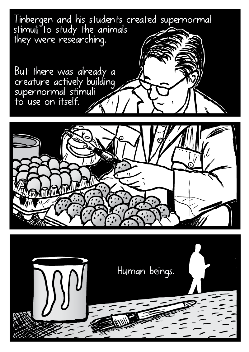
Note the extra ‘beat’ that the worldless middle panel provides to the flow of the story. Silence has the effect of removing a panel from a particular span of time, encouraging readers to linger on the artwork a little longer. If I had simply drawn the Tinbergen image as a single panel taking up two-thirds of the scene, we would not get the extra moment of suspense before the reveal of “Human beings” in the bottom panel. Little moments like these can subtly affect comics readers’ experiences, and should be strategically employed by comics artists.
I must note that Supernormal Stimuli was the first comic that I drew digitally with a graphics tablet. By comparison, my earlier pre-2012 comics were drawn with pen and ink. Drawing digitally allowed me greater flexibility for experimentations with panel arrangements, and the use of reference images.
War on Drugs comparison scenes
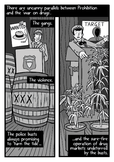
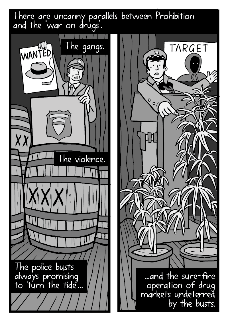
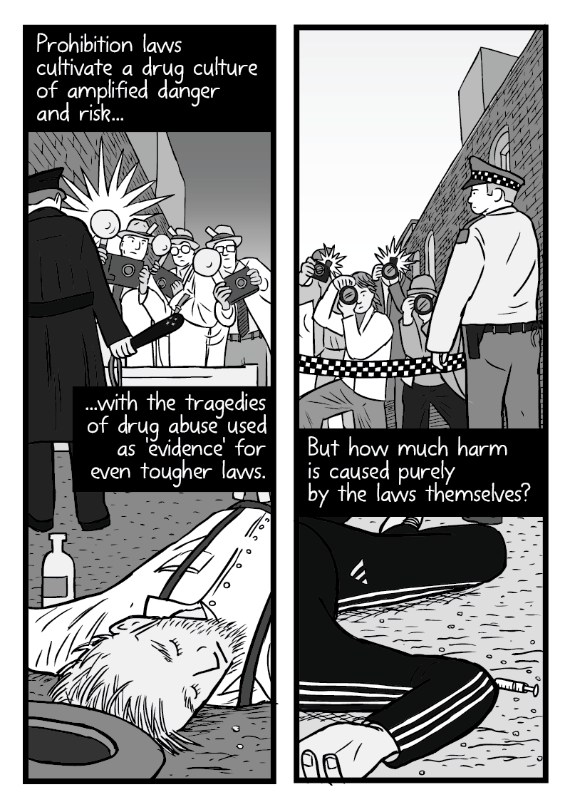
The premise of my War on Drugs comic is that there are great parallels between the harms of 1920s alcohol prohibition, and modern day drug prohibition.
From page 20 onwards, I use the ‘split panel’ effect on a few pages, to emphasise the comparison between the harms of 1920s prohibition and modern drug prohibition laws.
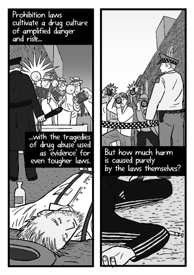
I particularly like the comparison between the dead alcoholic wearing 1920s period clothes, and the dead drug user wearing an Adidas tracksuit (see above). I composed the scene so that the human figure is in the same pose in both panels.
Earlier in the comic—on page 14 (below)—I used the ‘broken into panels’ effect to show Milton Friedman at a globe. Friedman is considering the international effects of American drug policy on the world. Again, note how the splitting of one scene into multiple panels acts as ‘punctuation’ to break up the reading experience.
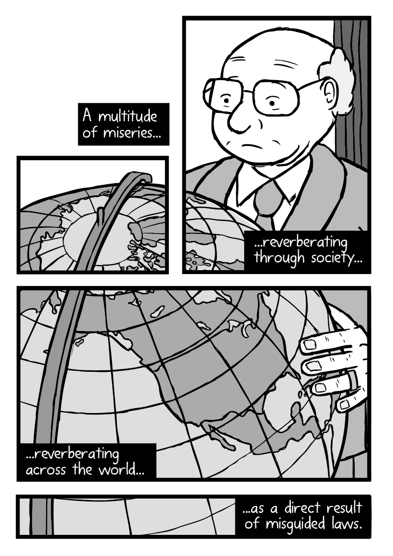
Of particular note is how the largest panel focuses on North America on the globe, providing pause to think about how the United States influences the other countries of the world.
Rat Park
Page 19 of Rat Park (below) is a comparison between the way that rats behaved inside the ‘Rat Park’ drug experiment’s enclosure, versus the way that the caged rats behaved.
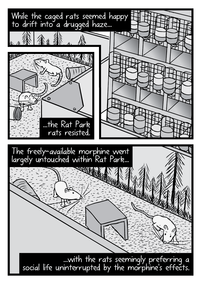
After I decided that I wanted this page 19 scene (above) to be a single image broken into smaller frames, I composed an arrangement that works with the reader’s natural tendency to read from top-to-bottom, and left-to-right. Comics artists should always consider the innate way that readers will automatically tend to read the page. Don’t fight your readers’ instincts, embrace them!
There are a few other examples of this split into multiple frames effect in Rat Park, but my absolute favourite is page 37 (below). This scene of Rat Park shows Bruce Alexander walking along a Vancouver street with the Harbour Centre tower in the background.
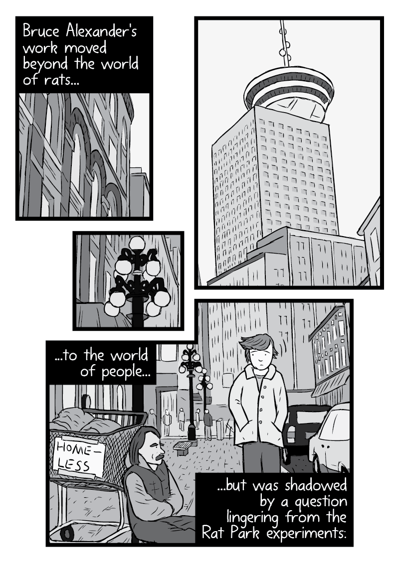
Something about this composition has always seemed really pleasing to my eyes. Including the way that the lamplight is isolated into its own panel for no particular reason.
Peak Oil
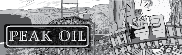
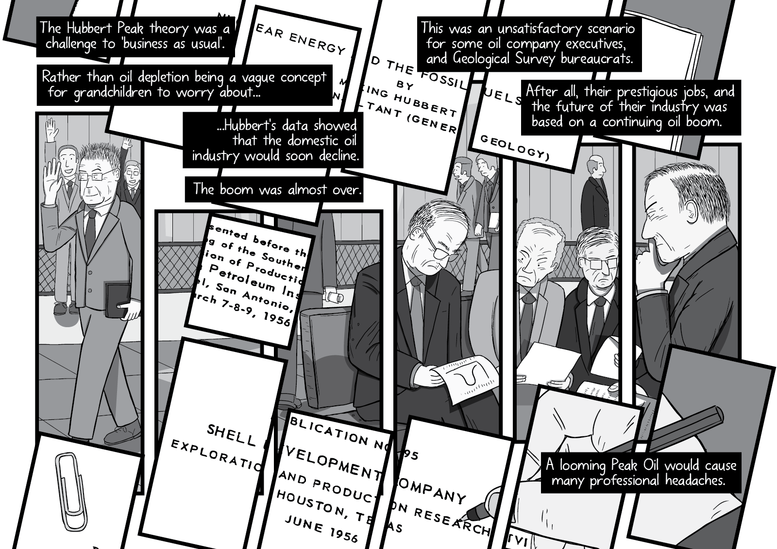
Again, I used the technique multiple times in Peak Oil. A prominent early example is on page 5 (below), showing the geologist M. King Hubbert getting upset at the execute assistant from his employer Shell Oil, who urged him to cancel his speech about fossil fuel depletion.
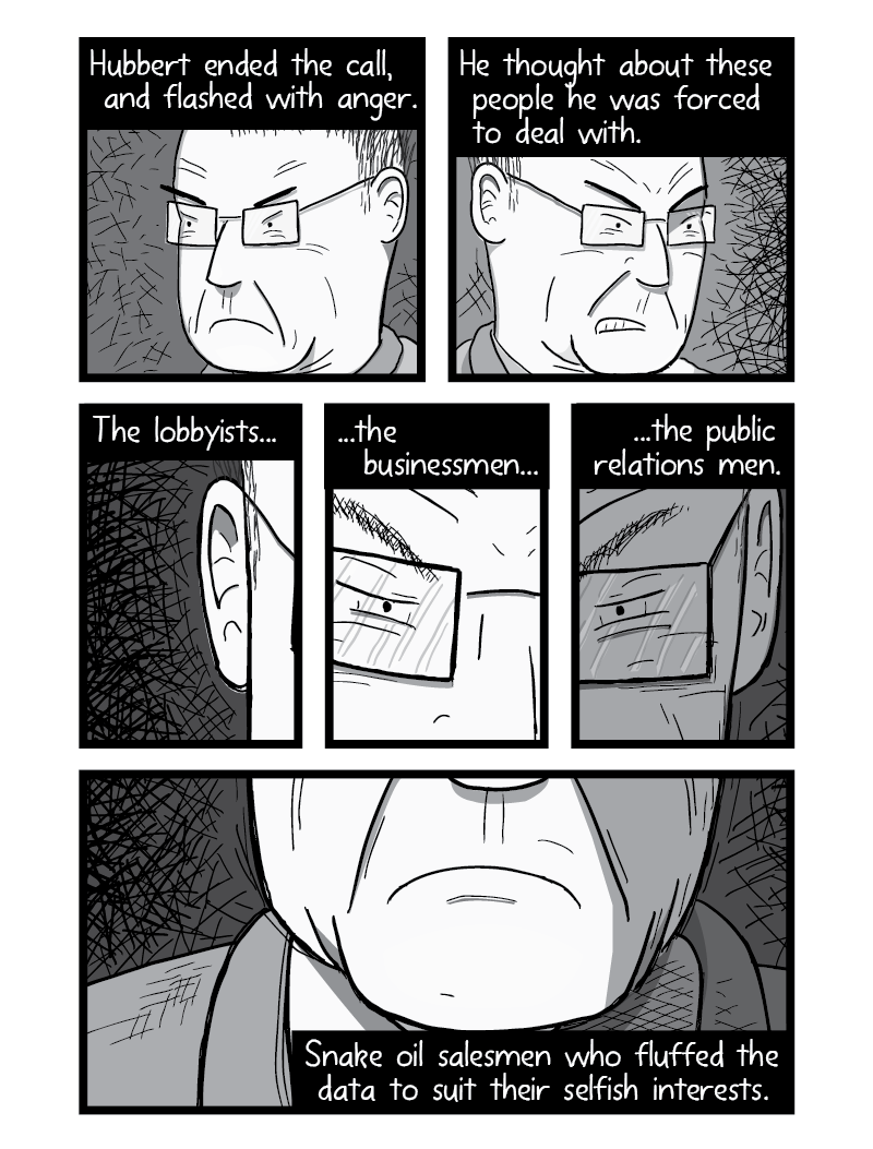
By breaking up one image of Hubbert’s angry face into multiple panels, we get the impression of the rapid-fire series of thoughts that would have run through Hubbert’s raging mind. Time is both sped-up and slowed-down at the same time, depending on whether the reader focuses on the individual panels, or the whole face.
Later, on pages 68-69 (below), I use the technique to layer two pieces of information onto the same page. In this case, we see oil company executives sitting in the lobby of a hotel, as well as diagonally-tilted panels showing Hubbert’s 1956 paper “Nuclear Energy and the Fossil Fuels”.
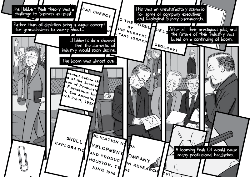
As you can imagine, it takes a lot of planning to ensure that the key elements of these illustrations are visible, and not outside the borders of the panels!
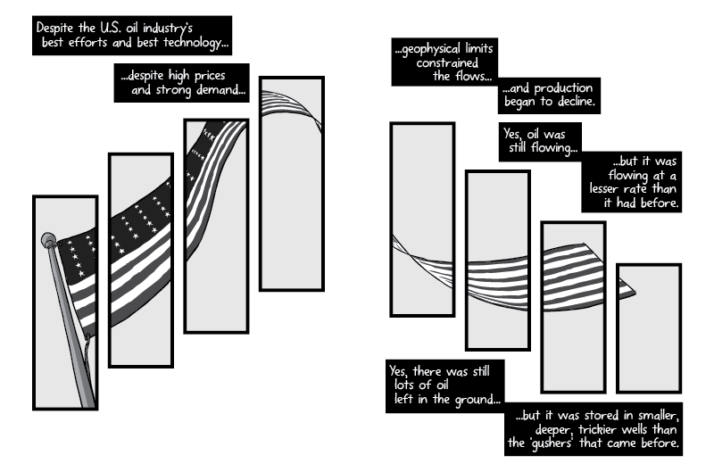
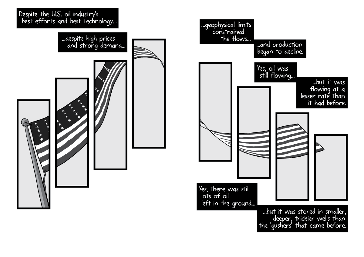
Also, on pages 76-77 (below), I showed an under-shot of an American flag blowing in the wind, broken into multiple panels. The shape of the flag—and the composition of the panels—matches the bell curve shape of Hubbert’s predicted ‘peak oil’ phenomenon.
My Billboards comics
So far I have published three comics of my Twenty-Five Arguments Against Billboards collection. Here are the times that I’ve used this ‘split into panels’ technique so far:
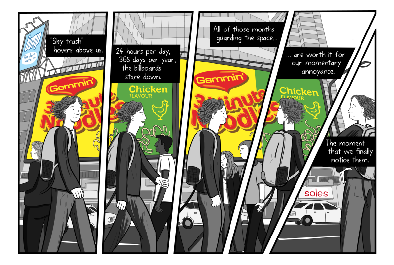
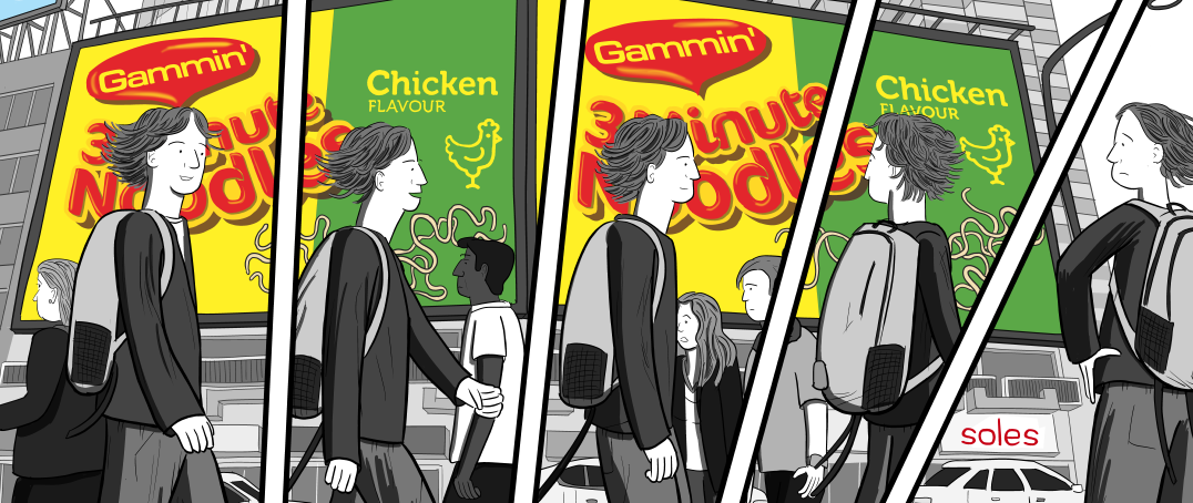
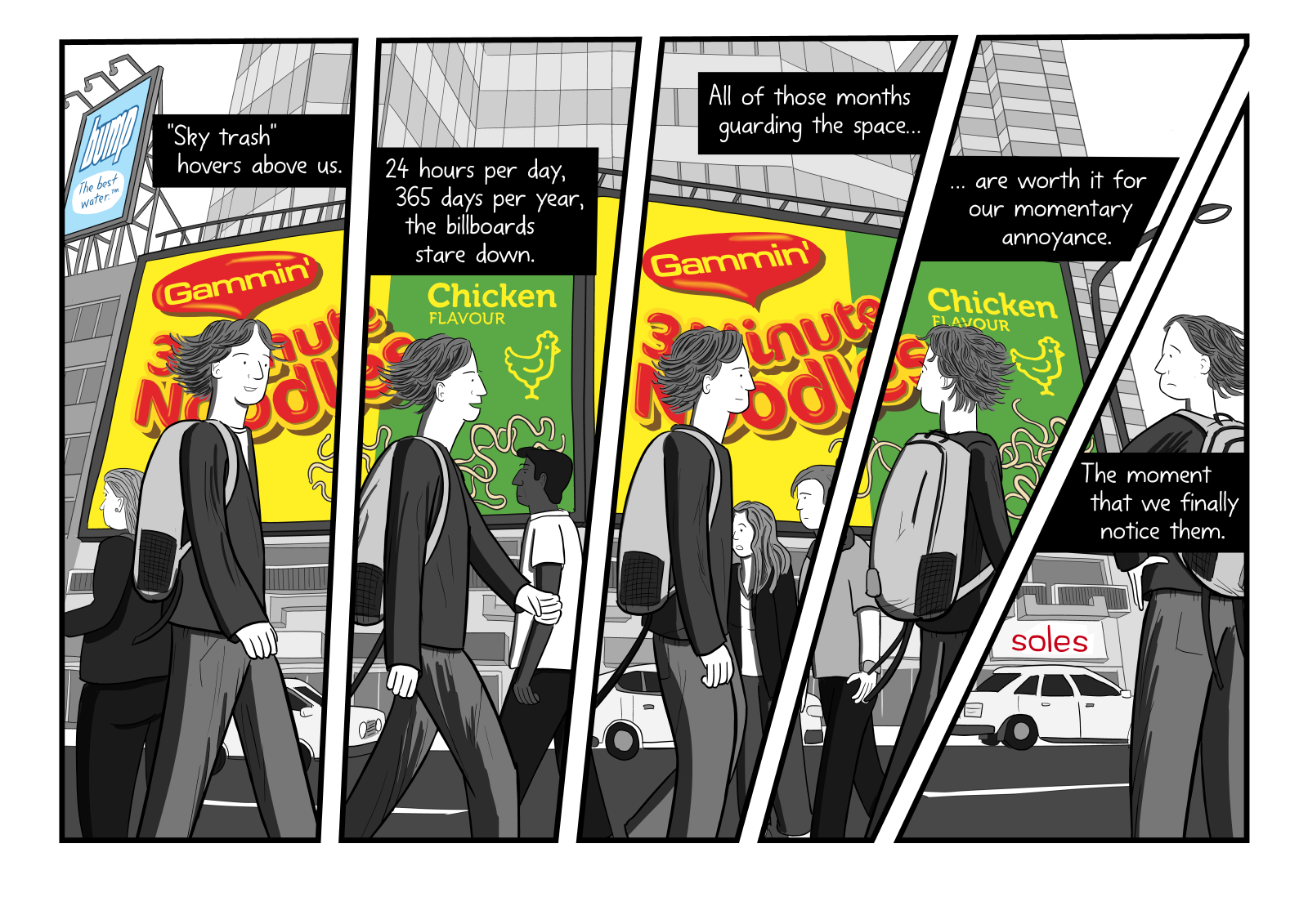
In The Crudest Form of Advertising, I use the effect to show how billboards lurk on the walls of our cities, occupying visual real estate. On pages 7-8 (above), I show a Maggi Noodles billboard that I am blissfully unaware of, until I finally turn to notice.
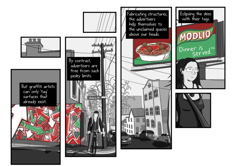
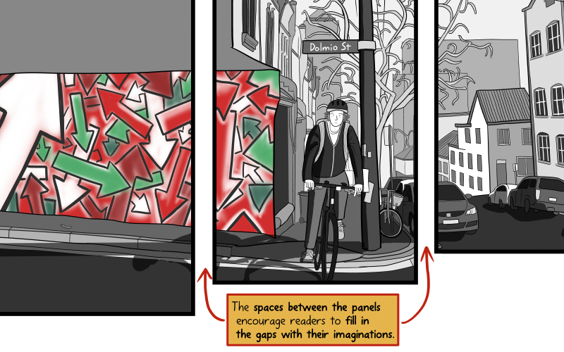
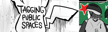
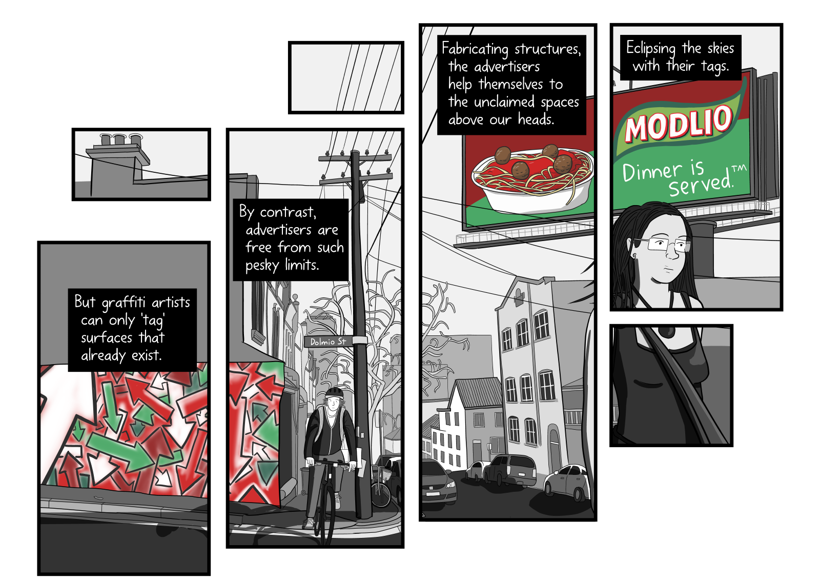
As explained in far greater detail in my other blog post, I used the ‘split into panels’ effect in the Dolmio pasta sauce page of my Tagging Public Spaces comic (above). The primary reason for doing this was to draw the reader’s eye up towards the sky, towards the billboard. A side-effect is that it also looks more visually interesting than a single unbroken scene would have.
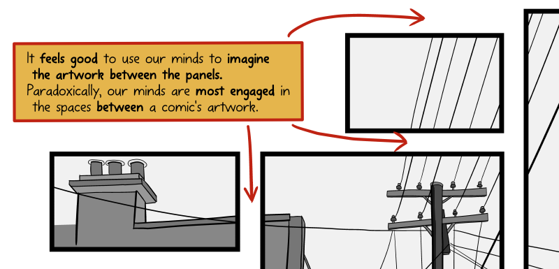
The blank space between the panels gives your brain something to do, as it mentally fills in the gap. We imagine the missing overhead power lines, the car windshield, or the shape of the woman’s torso that are between the panels (above), and it feels good to use our imaginations.
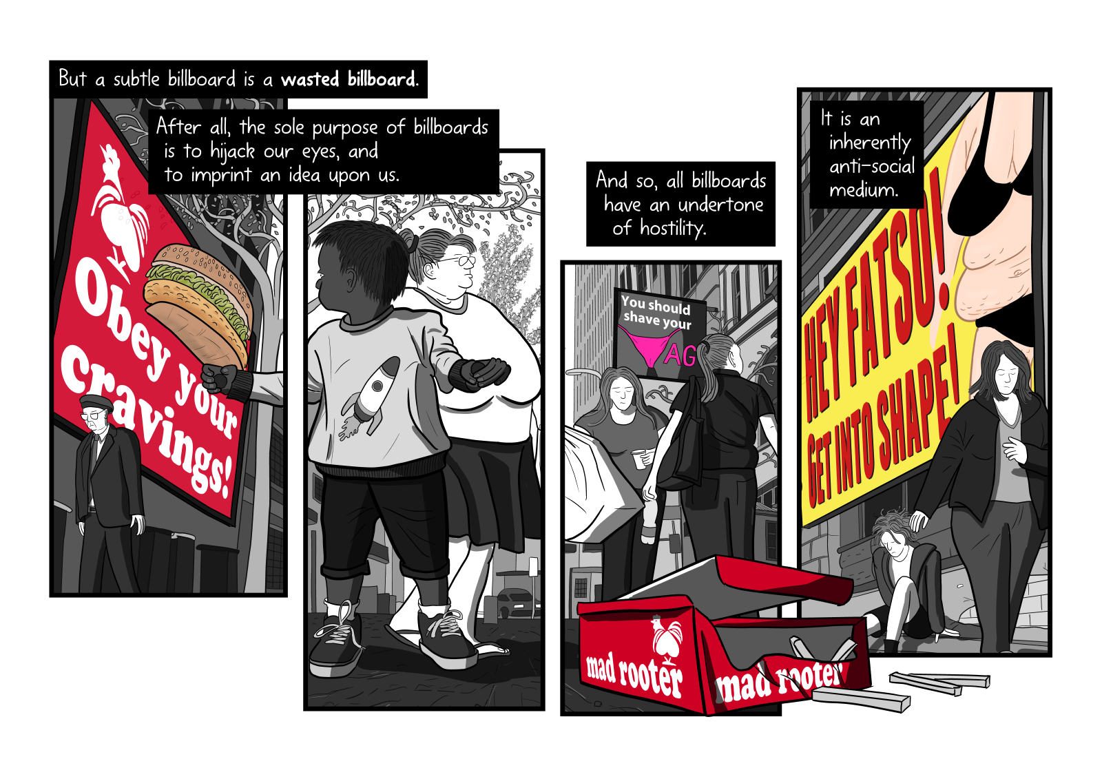
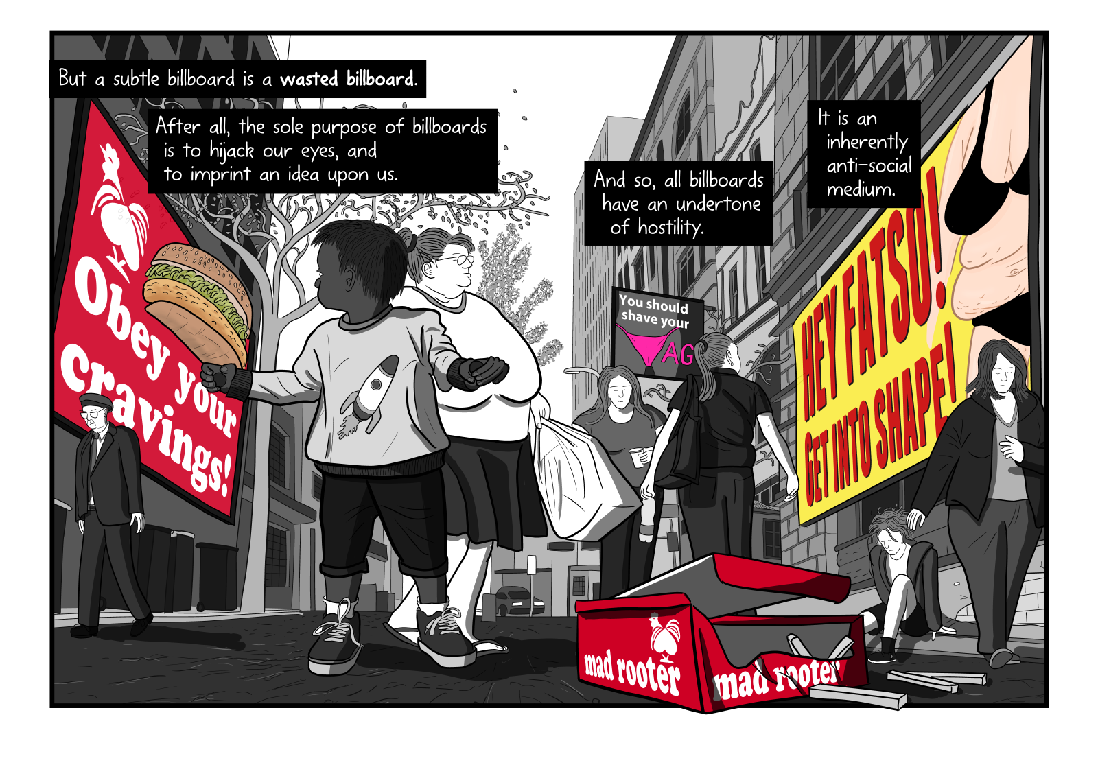
I use the visual trademark twice in Litter on a Stick. The first is in my page featuring the Red Rooster ad (below). I composed the scene so that the image shown in each of the four panels corresponds with the text in the caption that appears above each panel. So that the young boy is having an idea imprinted upon him when he sees the burger billboard. And the “Hey Fatso!” billboard is an example of the anti-social nature of billboard advertising.
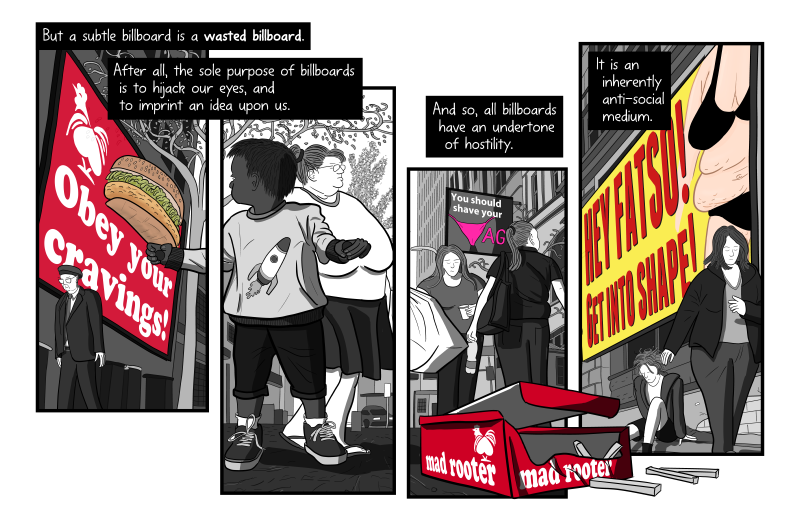
Think about how the separation of the image into four panels amplifies the effect of the text. Below is a version of the scene where I show the four text boxes floating inside one large unbroken double-page spread.
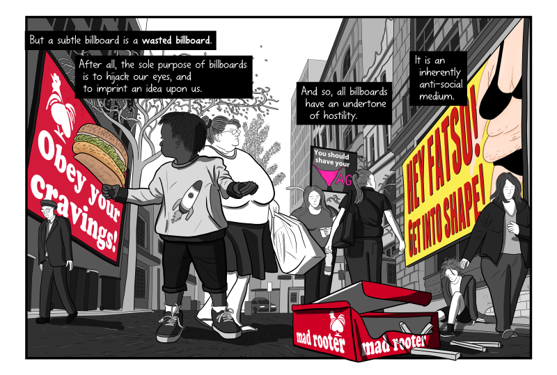
Personally, I prefer the first version of the page, which is broken into the four panels. Something about isolating the artwork in this way encourages the reader to linger a little longer on each point.
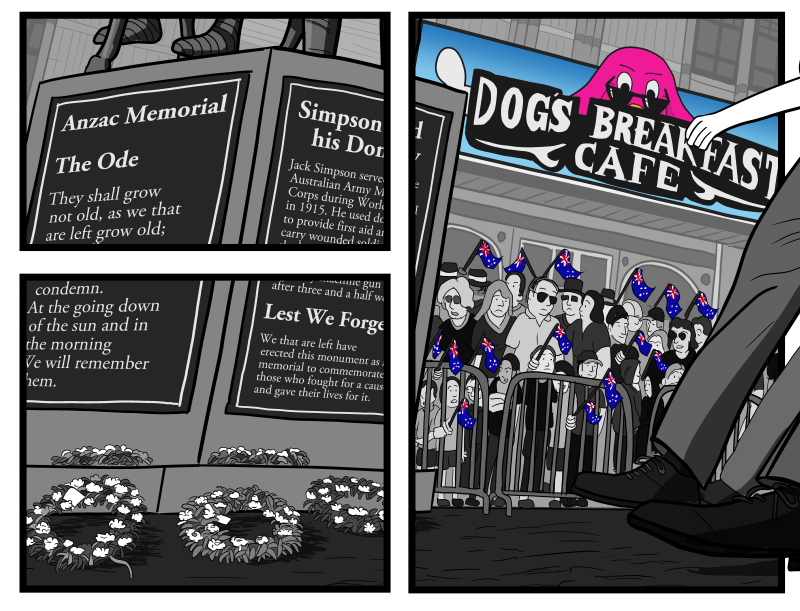
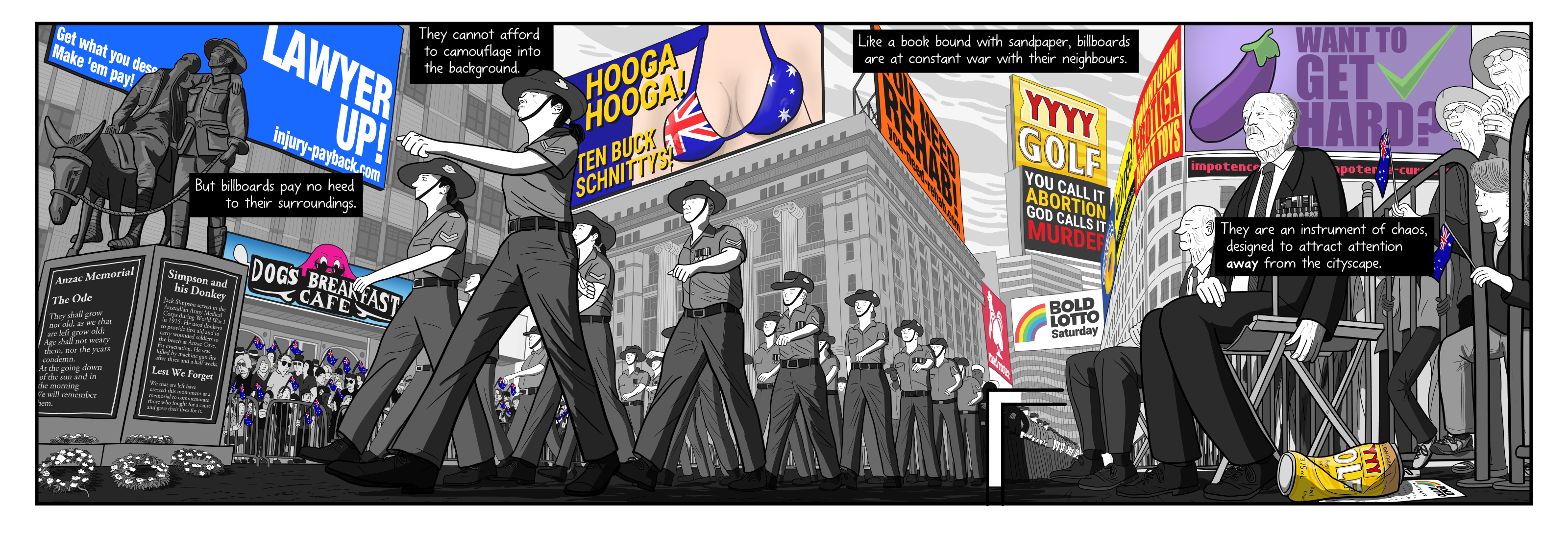
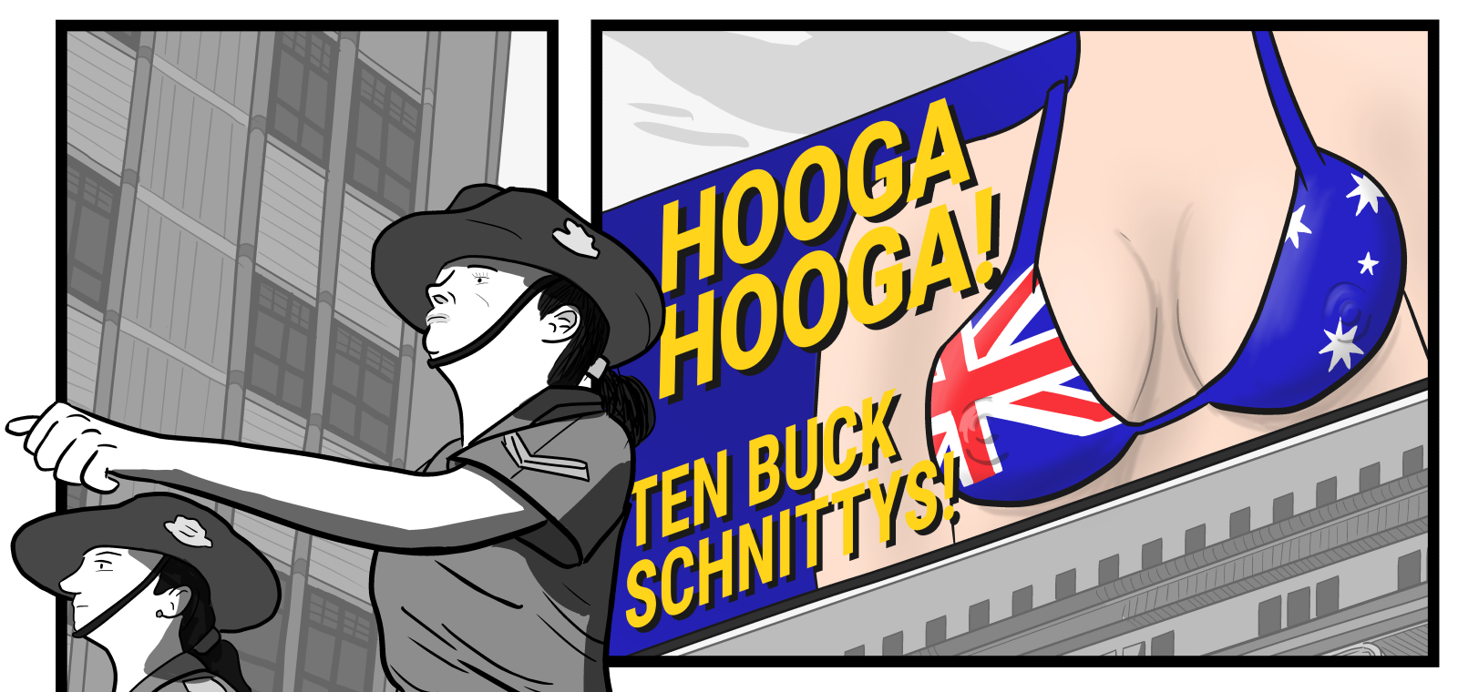
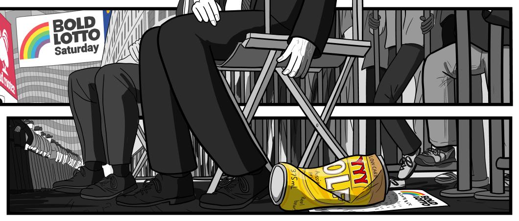
The other example from Litter on a Stick is my Anzac Day scene (below). Click on the image to zoom in, as it is a quadruple-page spread! Here, I tried to contrast the sombre mood of a war memorial service, with the most inappropriate billboard ads that I could imagine.
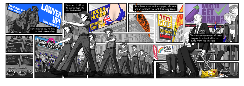
Above is the final image that appears in my comic. It took me over 35 hours to draw (and followed a first draft of the scene that I abandoned after 24 hours of effort).
Let’s compare how that scene would have looked if I had instead displayed it as a single, unbroken scene.

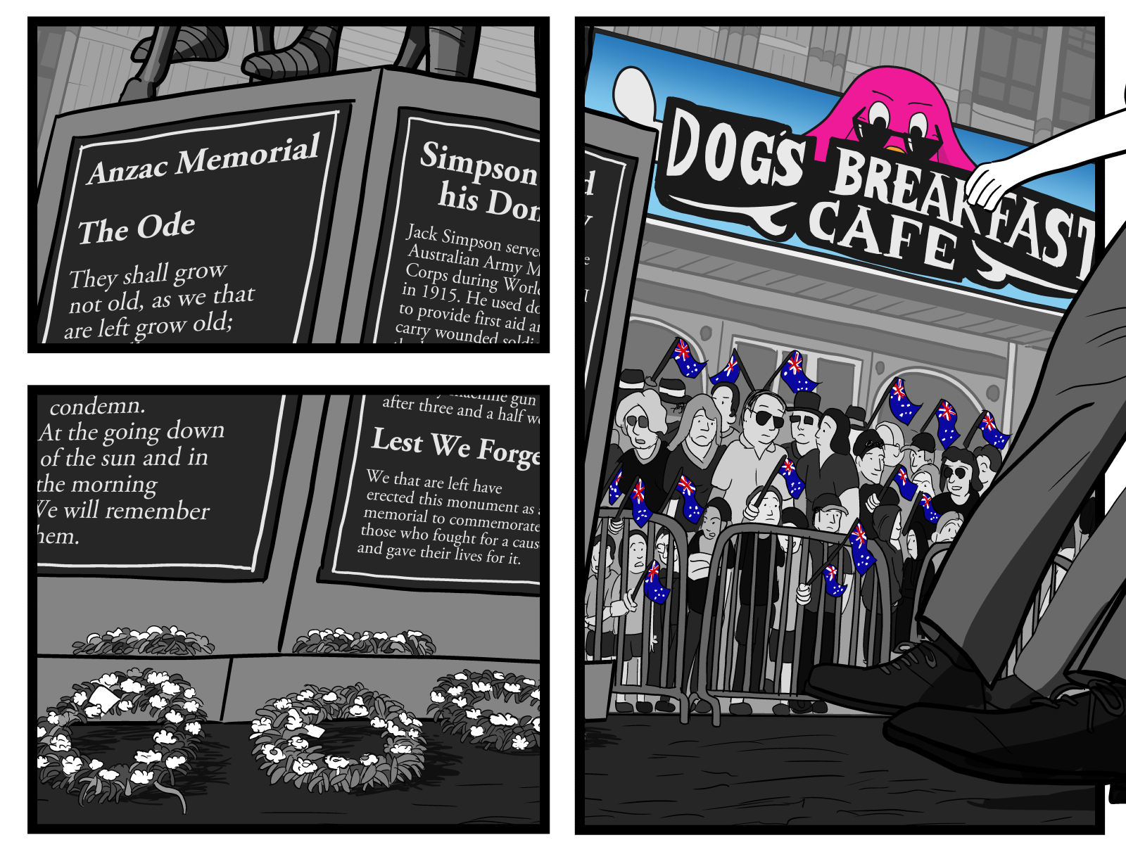
There is something about the division of the scene into panels that freezes the scene for closer inspection. We examine each of the sub-components, such as the wreaths resting at the bottom of the statue.
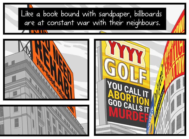
We see the billboard for $10 Chicken Schnitzels frozen in time (below), as an element for us to momentarily consider in isolation. We think about how the image of the bikini contrasts with the dignity of the female soldiers who we have just seen outside the panel.

And, continuing the theme from earlier pages, we see a littered XXXX Gold beer can, and a Gold Lotto lottery ticket on the ground. Seeing these isolated in the panel reinforces my comic’s argument that ‘billboards are litter’.

The effect reminds me of the ‘freeze frame’ effects in Beck’s iconic music video for “Devil’s Haircut” (1996) – see below.
Bringing back the visual trademark
Although many readers consider it my visual trademark, I shied away from using the effect for a number of years. For example, my three comics from 2018—Not Talking About Capitalism, Deprived of Religion, and I Used to Be Racist—are built almost entirely of unbroken double-page spread artworks. (In hindsight, I was overusing double-page spreads between 2016 and 2018, and they became less special than when I used them more sparingly pre-2015).
Having seen the recent success of my billboards pages with the ‘broken into panels’ effect, I am going to consciously re-introduce the visual trademark into my future comics. You have been warned!
Join my email newsletter to learn when I publish new comics to my website. Better yet, become my crowdfunding supporter on Pateron, and co-invest in my creation of these thought-provoking social commentary comics!
Comments