


Penmanship logo
My brother Andrew McMillen is a writer, and has written the book Talking Smack: Honest Conversations About Drugs (2014), as well as numerous feature articles.
In May 2015, Andrew launched a podcast entitled Penmanship. Penmanship is a podcast about the culture of writing in Australia. Each episode features Andrew interviewing an Australian writer, and holding a lengthy and in-depth discussion about their career and writing practice.
Andrew developed the podcast with his own initiative, and own finances. Despite this budgetary constraint, he wanted the podcast to be fully-fledged from its first episode. To ensure a high-quality recording, he invested in professional recording equipment, and a stand-alone website. He was also keen to have top-notch theme music and artwork from launch. So naturally, he sought my expert services (for the artwork!)
One scene, multiple outputs
Andrew wanted the Penmanship header image to be usable on the social media platforms Facebook, Twitter, Google+ and YouTube, as well as in his own website’s layout.
Each of these platforms have their own precise dimensions of height and width. One of my first tasks was understanding how they would all compare with each other. I used this handy infographic guide to social media image specs as at 2015. Here is how they compared:
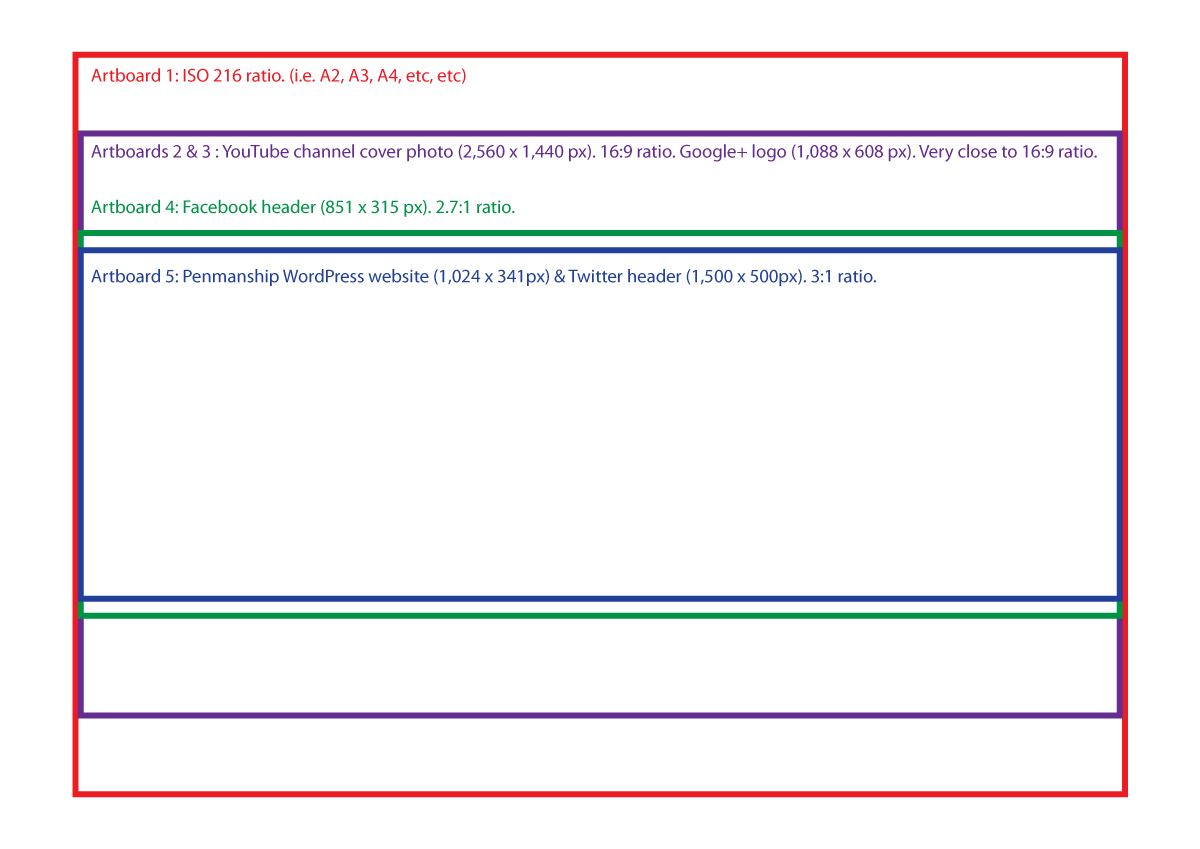
Therefore, Twitter would display a view that was letterboxed to the max. On the other hand, the YouTube channel would allow a view that was closer to square, allowing more of the top and bottom elements to be displayed.
As well as the social media exports, I thought that ISO 216 (a.k.a. international paper size) would be another handy ratio to supply the scene at. So that it could possibly fit onto A2, A3, or A4-sized prints. And so that I could draw extra Easter Egg-type content for my own personal amusement, and for the amusement of Andrew.
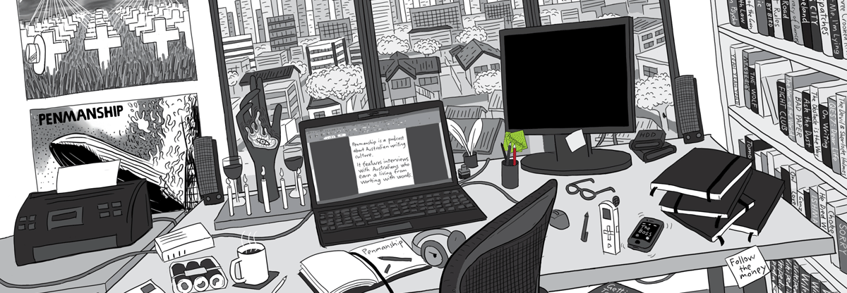
Here are two rough drafts of my illustration. I used these to arrange the scene so that important elements (like the printer, laptop, and monitor) would always be visible in each of the crops. On the vertical edges of the scene, I drew non-essential things that could be cropped out.
Draft version 1 (below)

Draft version 2 (below)

Brainstorming
Being a podcast about writing and writers, our concept ideas centred about imagery related to writers and journalists. Pens, pencils, quills, typewriters, dictaphones, hats with a ‘press card’ in them, et cetera.
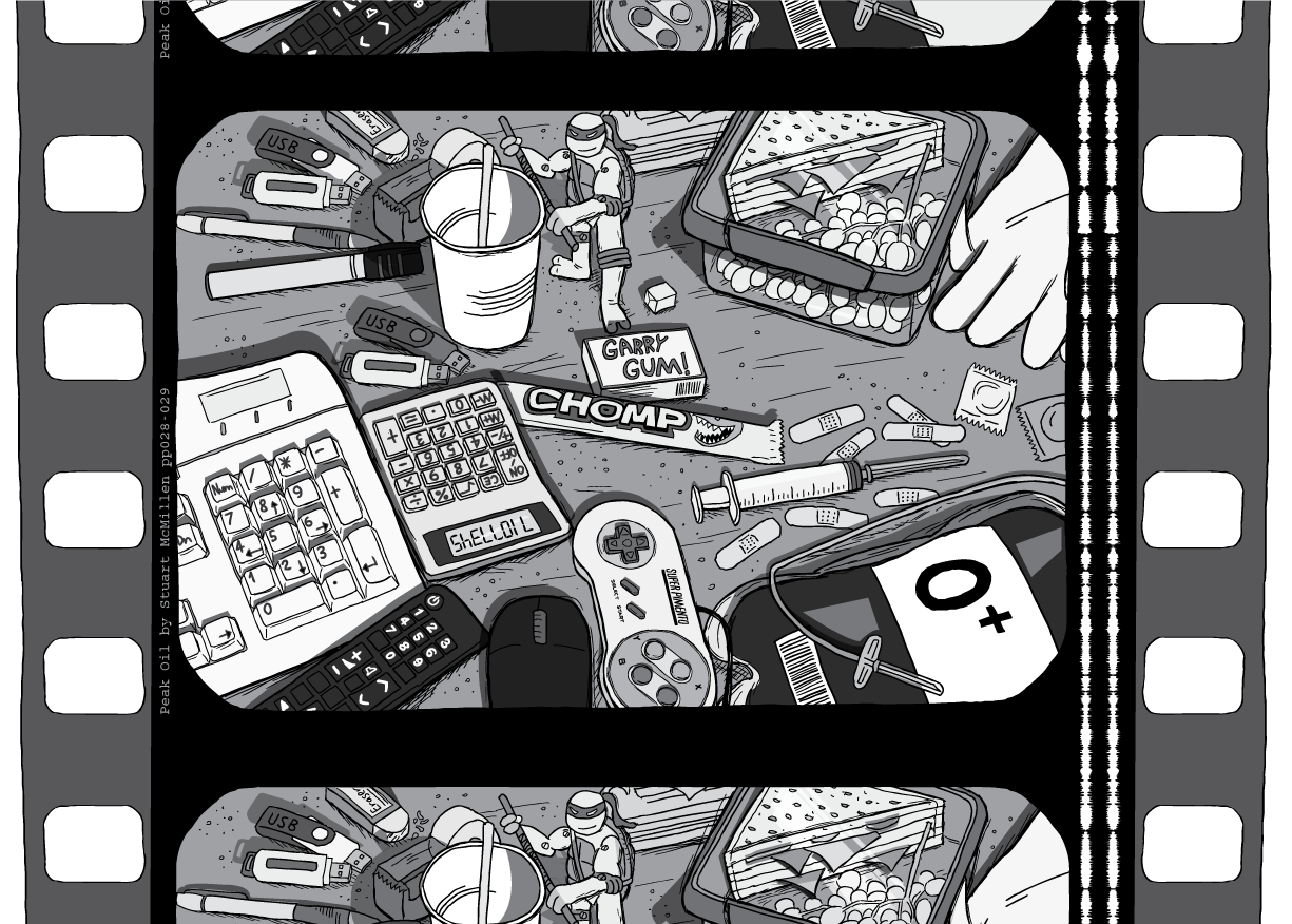
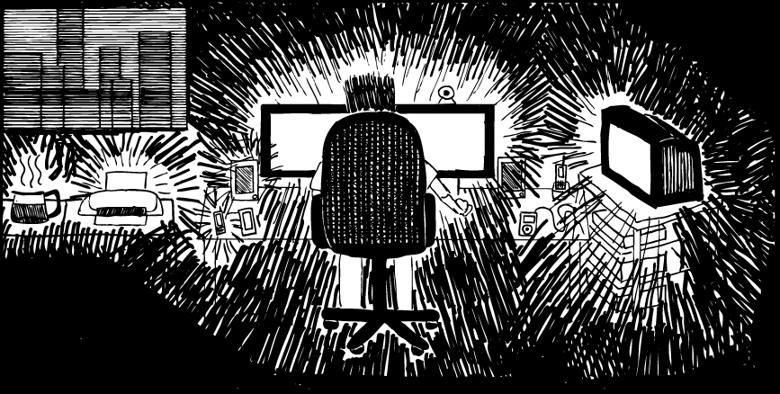
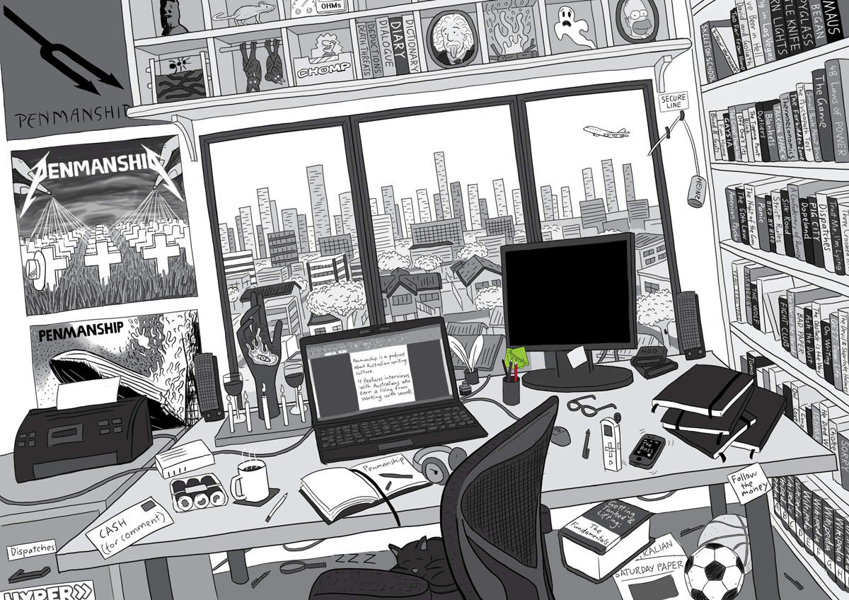
I suggested that the artwork show a writer’s desk, as though the writer was caught in the middle of a working day. The scene would display all of the associated tools and implements used by writers and journalists. The reason this sprung to mind was my recently-drawn desk full of plastic objects from pages 28-9 of my Peak Oil comic, which I launched in the same month that Andrew launched Penmanship. I also wanted to repent for my sins after publishing a crudely-drawn desk in my comic Amusing Ourselves to Death (2009). I wanted to re-draw that Amusing Ourselves to Death desk scene in more detail, one day.

Above: the 2009-era image from Amusing Ourselves to Death that I wanted to mimic and surpass.
For comedic purposes, I wanted the room to be a clutter of contemporary and anachronistic writing tools. Such as a laptop computer beside a typewriter, or an iPhone beside a fax machine. But still drawn with a serious, non-jokey vibe that made the peculiar combination look natural and commonplace.
Visual inspirations
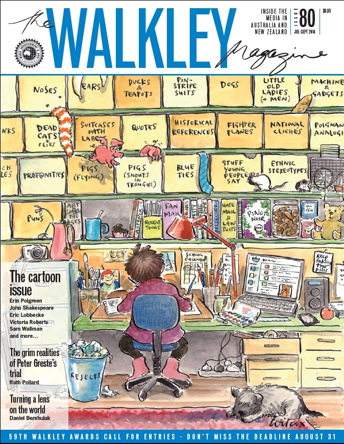
In my mind, I pictured a scene similar to Cathy Wilcox‘s excellent 2014 Walkley Magazine cover (pictured below). I imagined that the desk would have a wall directly in front of it, which would allow me to place calendars, posters and other visual elements.
Andrew, however, wasn’t so keen on this idea. He wanted the workspace to resemble something that he would like to personally work in. After unproductive years working in rooms without scenery, he has begun to see the importance of a workspace with large windows, offering an interesting view. Therefore, he was keen for my illustration to include large windows overlooking suburbia and a city skyline.
For comedic purposes, I was originally keen to make the office quite cluttered and messy, just like this and this and this. Again, Andrew steadied my hand, allowing a scene that was moderately messy, but not a total dump.
The concept evolves
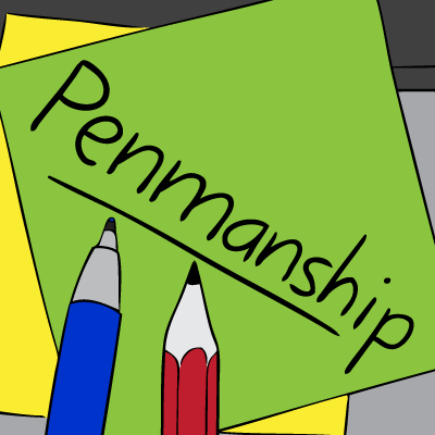
Andrew asked: so where will the word Penmanship be written in the artwork? My answer: in tiny writing on a Post-it Note hidden deep in the artwork.
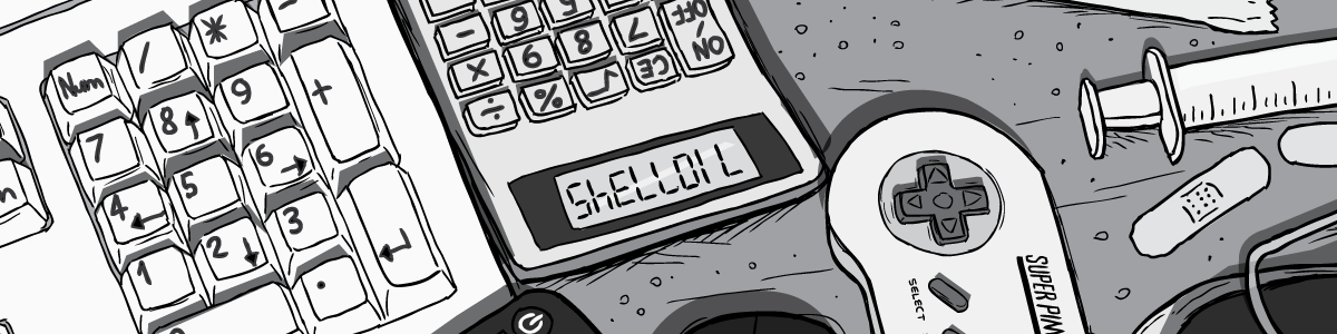
I knew that the Podcast would need both a square ‘logo’, as well as header images for social media platforms like Facebook and Twitter. I wanted the square logo to be similar to the hidden SHELLOIL text from Peak Oil page 28 that I described in this blog post.
I had just been trimming down my Peak Oil artwork for the blog posts that accompanied the comic’s launch. This process made me aware of the visual impact that can be achieved by cropping a large, detailed image down to just a small, isolated sub-component.
Andrew asked: how will they even recognise the Post-it Note in the wider shot, and recognise that the square logo is drawn from the larger scene? My answer: make the Post-it notes the only coloured part of an otherwise monochrome scene.
Colour combinations
After deciding the general composition of the square logo, I sent Andrew mock-ups that showed the various colour combinations of Post-it Notes and stationary. Here are 4 examples of the mock-ups:
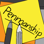
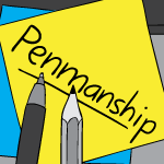
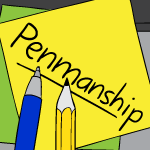
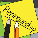
Ultimately Andrew chose a combination with green as the dominant colour. He wanted green to be the theme colour for the podcast, which would reflect in the colour of the hyperlinks on his website. While yellow is the most common Post-it Note colour, it is a poor aesthetic choice for hyperlinks on a white background. Below is the final colour combination:
Meeting the specs
Andrew uses the service LibSyn to host his podcast, as well as to syndicate the podcast to various platforms such as Apple’s iTunes.
The first thing I did was check Libsyn’s show artwork guidelines, to understand their preferred image specifications. The stipulation that jumped out at me was the statement “The image should still look good when sized down to 50×50 pixels in size.”
I knew that it would be challenging to create a 50×50 pixel image that both had the word ‘Penmanship’ clearly readable, as well as making it clear that the icon is supposed to depict a Post-it Note.
Ultimately, I was pleased with the 50×50 pixel output of the final image. The word ‘Penmanship’ is surprisingly recognisable, if not readable. The icon should easy to spot by anyone who is familiar with the larger square green logo via the podcast’s LibSyn, Twitter or Facebook pages.
The 50×50 pixel image: 
Extra hidden details
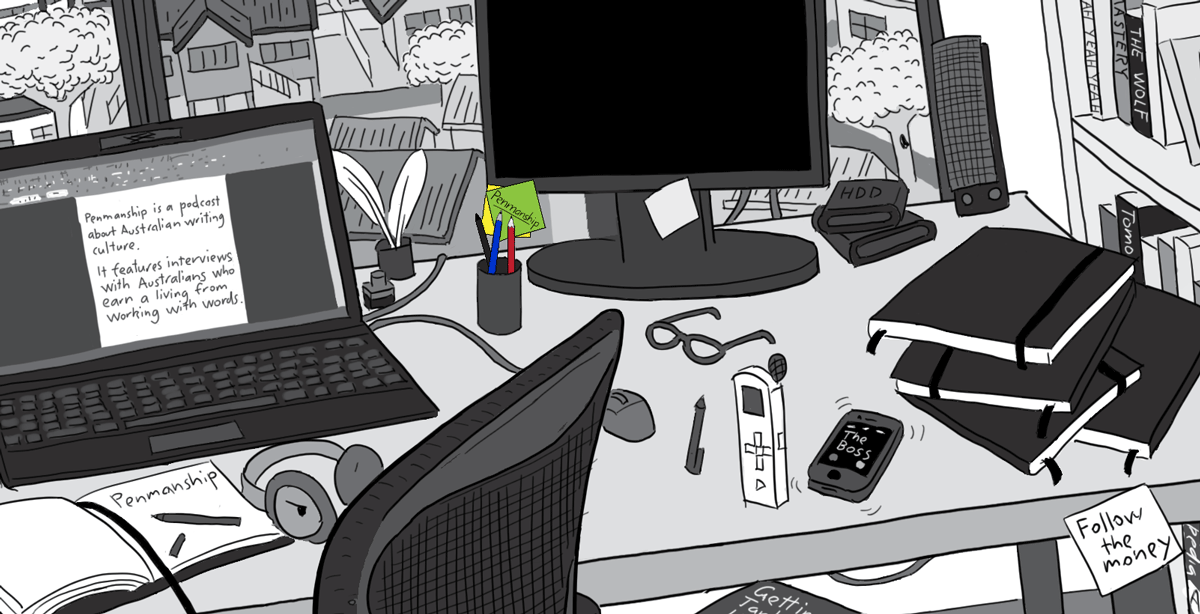
With Andrew’s permission, I added lots of little visual Easter Eggs into the scene. Andrew was keen on the scene reflecting some of his personal interests, and he provided lists of things to include, if possible.
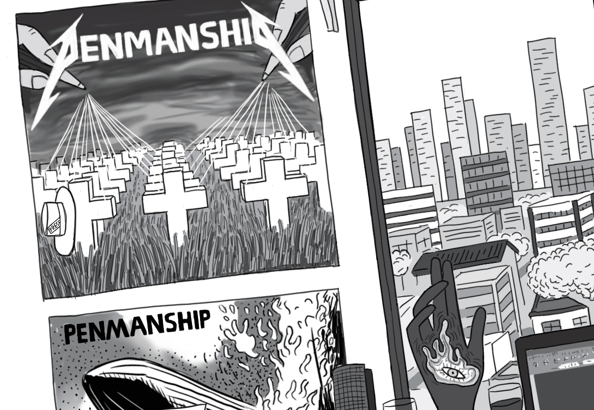
This included a list of his favourite albums. I wasn’t able to include them all, but I managed to include Queens of the Stone Age’s Songs for the Deaf, Metallica’s Master of Puppets, Led Zeppelin’s first album, as well as a small shrine to the band Tool, based on their Lateralus album cover.
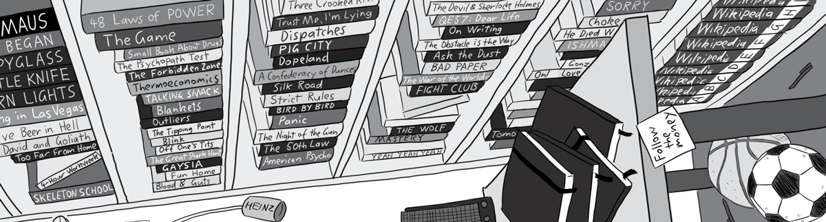
Upon request, Andrew provided a list of approximately 50 book titles which he rates as favourites. So I wrote those into the bookshelf. Perhaps one day he will publish a guide which lists all of these books, along with their authors and publication info.
I also included a bunch of unusual objects, to fill up the space. For example, I had recently watched the film All the President’s Men, about the Washington Post journalists who met with informant ‘Deep Throat’ while investigating the Watergate scandal. Penmanship made me think of these investigative journalists, hence a Post-it Note with the film’s famous line “Follow the money”.
Below is the full, uncropped image, including details not visible through the social media crops:
Comments