LineCheck Accounting logo

LineCheck Accounting: a music industry accounting business
In mid-2019, I was approached by my accountant Scott Maughan to design a logo for his music industry accounting business.
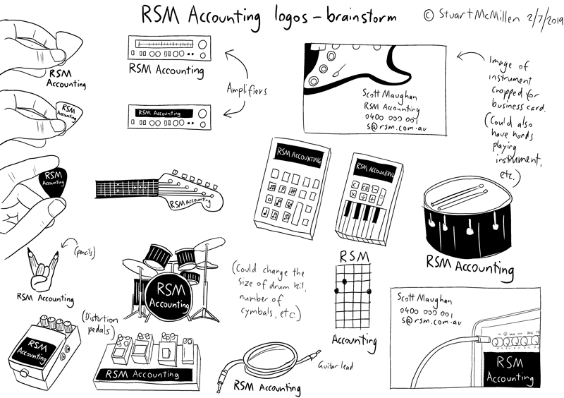
Scott Maughan is the “rock and roll accountant”, with extensive experience working in the Australian music industry. This history includes a history managing the books for some high-value clients such as Brisbane band Powderfinger and the record label Dew Process. Accordingly, my early brainstorms reflected a lot of rock and roll imagery, including guitar picks, amplifiers and drum kits.
Below is my initial brainstorm that I sent to Scott Maughan and his business partner Mel Botha:
Click the above image to see a high-res version of this brainstorm. (Note that the business name changed from RSM Accounting to LineCheck Accounting following the early drafts of these logos).
Guitar chord chart: the winning design
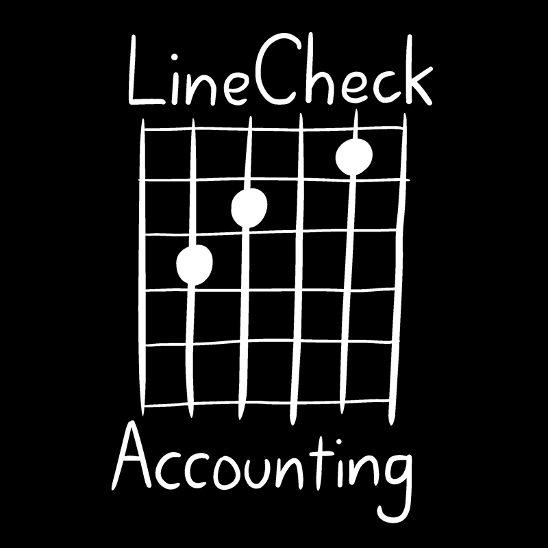
Scott and Mel honed-in on one of my designs featuring a diagram of a guitar chord diagram. They liked that it was a design that would appeal to music fans, but would also be relevant for Scott’s clients who are outside the music industry. As well as looking like a guitar chord chart, the logo also resembles an accountant’s ledger.
Being a music buff, Scott asked me to show him draft versions of the logo featuring different chords. Scott joked how he was trying to find the guitar chord with a sound that best represented the attitude of his company!
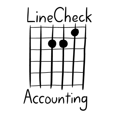

Above: logo options with A minor and C guitar chords (left and right, respectively)
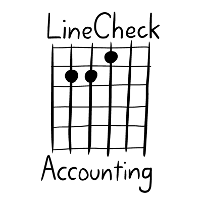
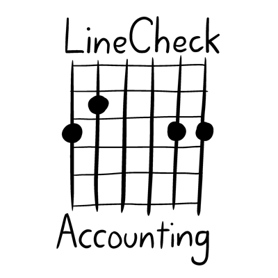
Above: logo options with E and G guitar chords (left and right, respectively)
After considering these options, Scott and Mel settled on the C chord logo as their preferred option. I provided them with both a black-on-white, and a white-on-black option. They are using both of these different versions in different places. For example, the logo with the white background suits being included on their letterheads and email signatures, whereas the black background logo makes for a stunning business card.

Testimonial from Melissa Botha, LineCheck Accounting
We engaged Stuart earlier this year to develop a business logo for our small business. Our clients come from a variety of backgrounds and professions and we wanted to capture the music / arts focus of our business, while not alienating our other clients (primary producers, sole traders, non-arts employees) and any new clients as well.
The logo Stuart developed fit the bill perfectly; a musical chord coupled with an accounting grid.
Stuart was very easy to deal with; upfront estimates provided, speedy development of brainstorming ideas, and final tweaks made in a very timely manner. Stuart provided a number of logo sizes to suit our requirements. We have received much positive feedback about the logo and I couldn’t be more pleased with the outcome. I have no hesitation in recommending Stuart and his work.
Melissa Botha, Office Manager, LineCheck Accounting
26 November 2019


Comments